color assessment
Assess colors and brightness in your image under neutral viewing conditions to avoid perceptual issues.
When developing an image, the way we perceive brightness, contrast and saturation is influenced by the surrounding ambient conditions. If an image is displayed against a dark background, this can have a number of adverse effects on our perception of that image:
- Exaggeration of the perceived exposure makes the image seems brighter than it really is. This is nicely illustrated by the Adelson checkerboard shadow effect.
- A decrease in the perceived saturation in the image makes the colors seem less rich than they really are (the Hunt effect).
- A decrease in the perceived contrast in the image makes the tones seem flatter than they really are (Bartleson-Breneman effect 3)
The end result is that the final image can end up being too dark and overly-processed in terms of contrast and color saturation. To avoid this, the color assessment module in the darktroom places a grey and white frame around the image to help the user better assess the colors in the image
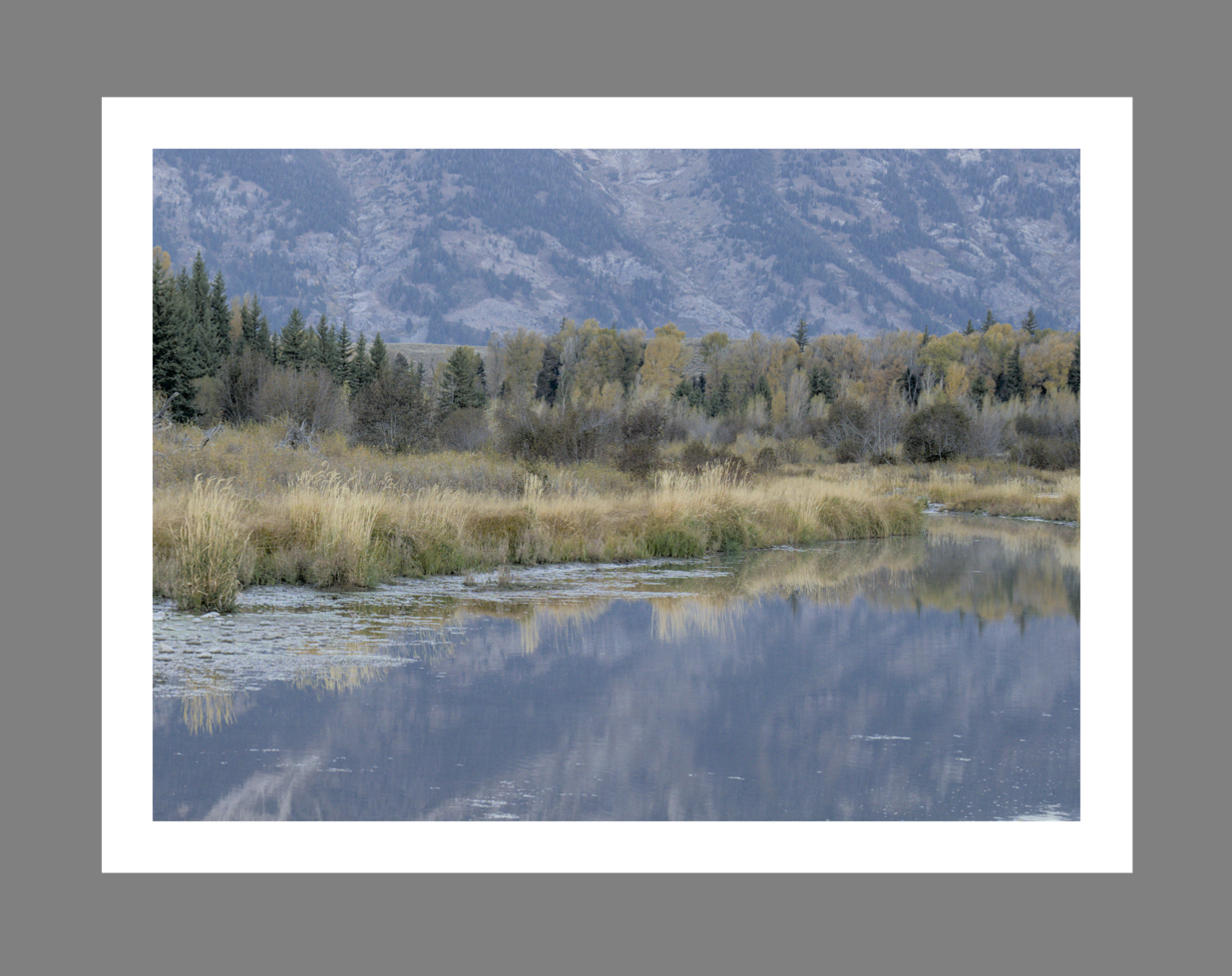
When the color assessment button
![]() is selected in the bottom panel, the image is zoomed out so that a thick mid-gray border appears around the image to act as a reference against which to compare the image’s tones. A thinner white border is placed immediately around the image to give the eyes a basis for comparison when looking at parts of the image that are meant to be a bright white.
is selected in the bottom panel, the image is zoomed out so that a thick mid-gray border appears around the image to act as a reference against which to compare the image’s tones. A thinner white border is placed immediately around the image to give the eyes a basis for comparison when looking at parts of the image that are meant to be a bright white.
Although the color assessment mode provides a mid-gray surrounding to the image, it is recommended that you also set your user interface (in preferences > general) to one of the “grey” themes. These themes are designed to provide a user interface that is close to middle gray (it is actually slightly darker to allow better contrast with the text in the user interface). When one of these themes is used together with the color assessment mode, this will help to avoid the above perception issues.
Color assessment mode can also be toggled by pressing Ctrl+B.
The total size of the grey and white frame and the relative size of the white frame may be adjusted by right-clicking
![]() . This will bring up a control panel with two slider controls:
. This will bring up a control panel with two slider controls:
- total border width relative to screen
- Adjust the size of the combined grey and white border. Increase to grow the total border (and shrink the image). Decrease shrink the border (and grow the image).
- white border ratio
- Adjust the white border relative to the screen. Increase this slider to enlarge the the white border. Decrease to shrink the white border. The image size will remain unaffected.